Project Overview
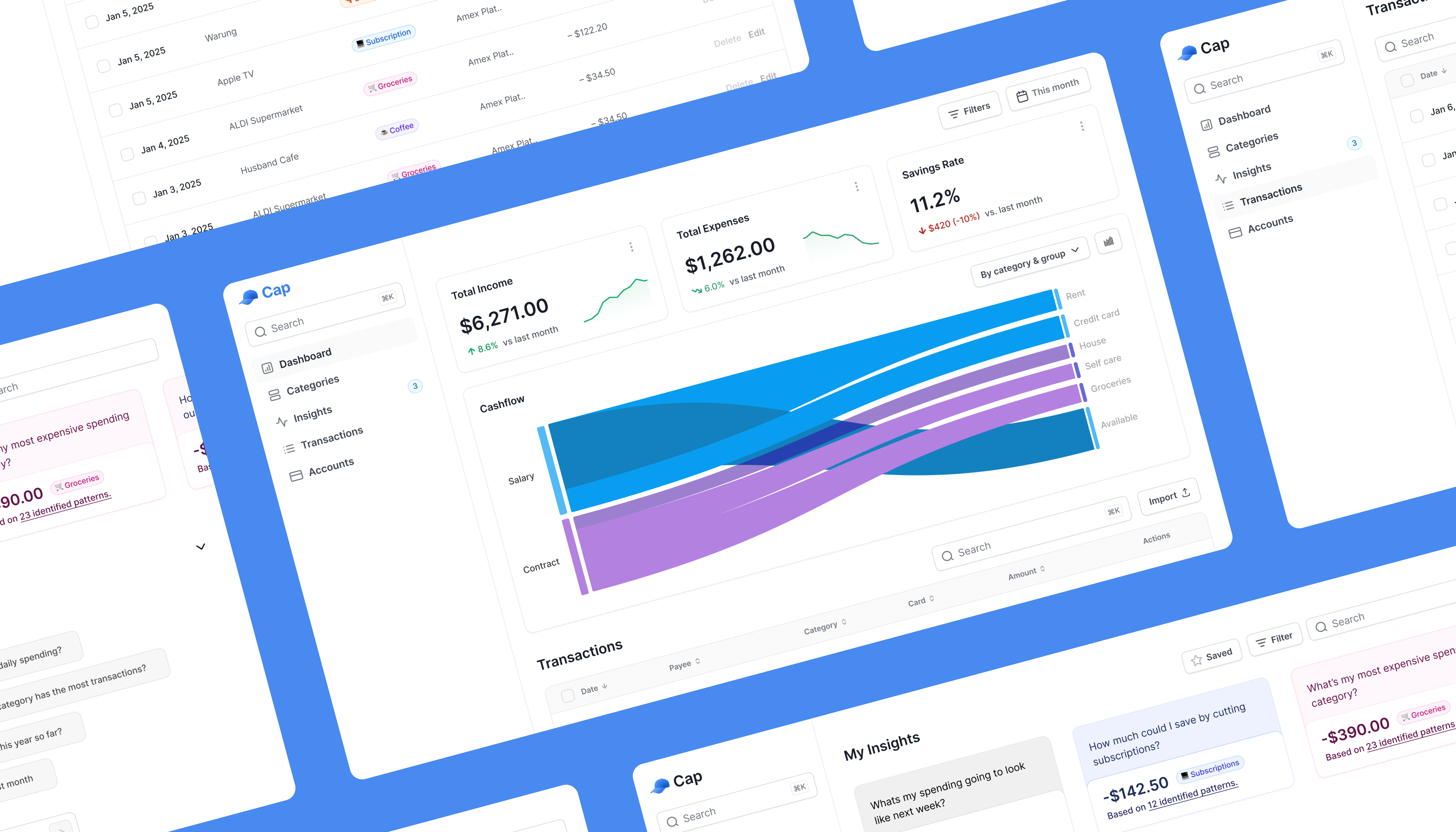
Cap is a personal finance app I co-founded, designed, and developed to simplify financial management for young users. Frustrated by clunky spreadsheets and feature-bloated apps, I combined my UX design and engineering expertise to create a streamlined tool featuring bulk transaction categorisation, AI-driven insights, and visual spending summaries. From user research to coding, I ensured every detail aligned with Cap’s mission to make managing finances effortless and actionable.
Project Type
- Co-founded Product
Duration
- 6 months (and ongoing)
Role
- UX Designer, Developer, and co-founder
The Challenge
Key Insights
39%
of Australians experience financial stress, especially younger generations, highlighting the need for personal finance accessible tools.
— Equifax Report50%
of Australians lack financial literacy, leaving them unprepared to manage money effectively.
— ANZ Financial Wellbeing Report 2021Research & Insights
Paint Points Identified
⏳ Time-consuming categorisation
Manual categorisation in spreadsheets was inefficient and prone to errors.
💡 Lack of actionable insights
Existing tools provided raw data but failed to highlight spending trends or offer recommendations tailored to users who are not finance-savvy.
⚠️ Error-prone data imports
Importing data often led to duplication issues and inconsistencies.
Broader Trends
⚙️ Flexibility matters
Young users avoid rigid systems, favouring tools that adapt to their needs.
🔑 Personalisation is key
Custom categories and tailored insights significantly enhance engagement.
Hypothesis
A user-centric finance tool that combines intuitive transaction management with personalised insights can improve financial literacy and reduce stress for young adults.
Design Process
To bridge design and functionality, I took an iterative approach that combined wireframing, prototyping, and Proof of Concept (POC) development:
📝 Wireframing & Prototyping
- • Started with low-fidelity wireframes in Figma to quickly map out layouts and flows, keeping the focus on usability and core functionality.
- • Developed prototypes to test features like transaction categorisation and visual insights, gathering early feedback to refine the user experience.

User flow for the POC
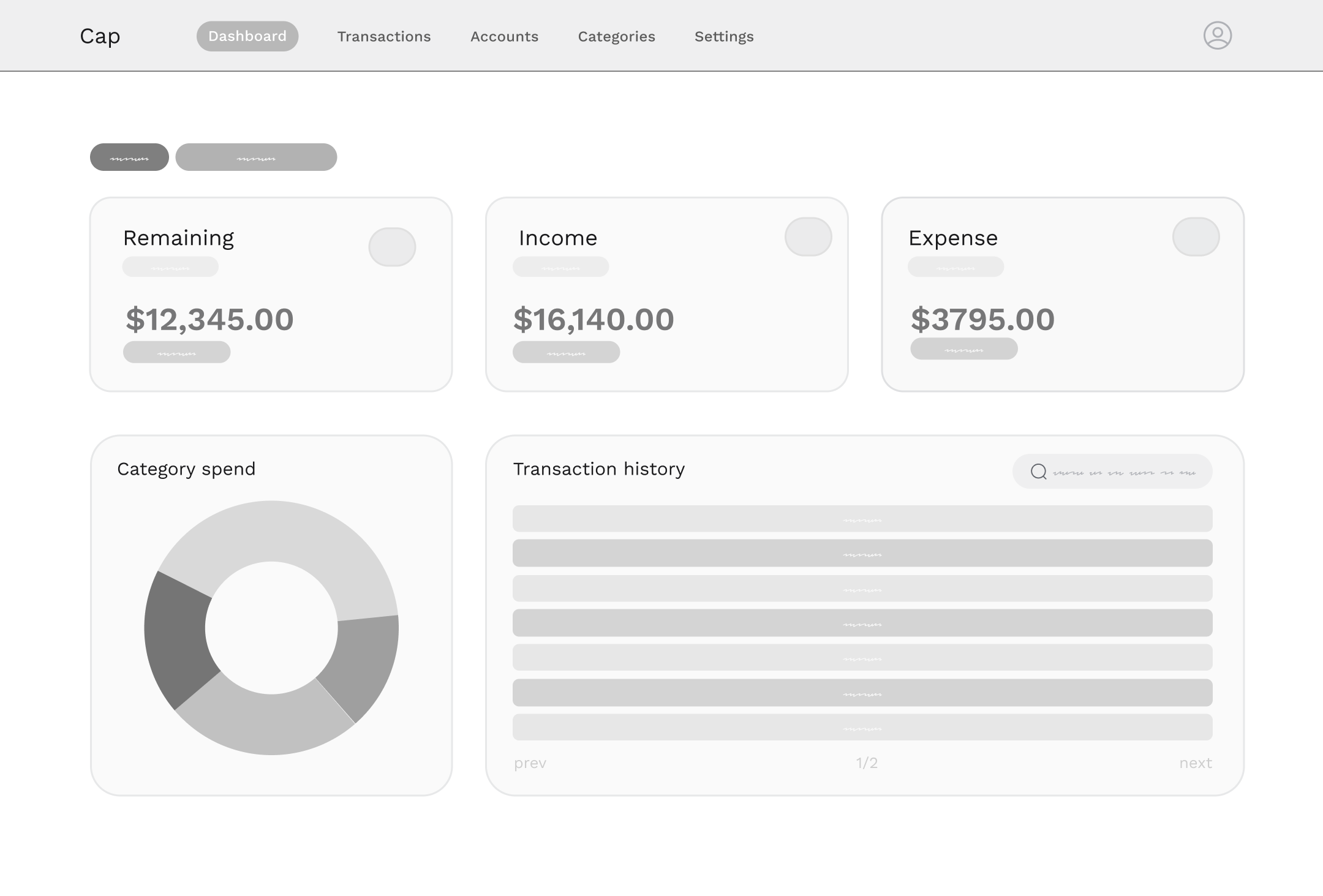
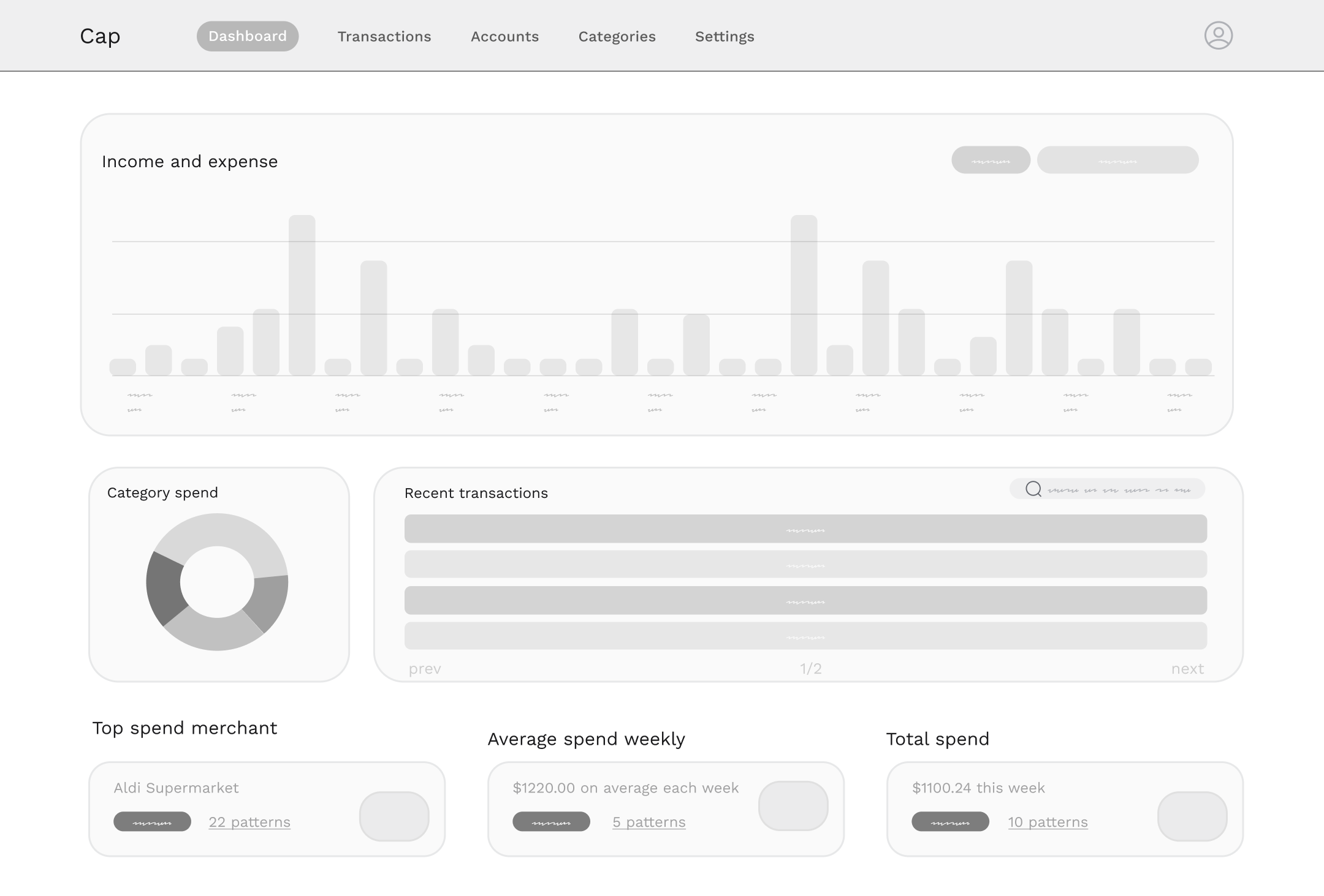
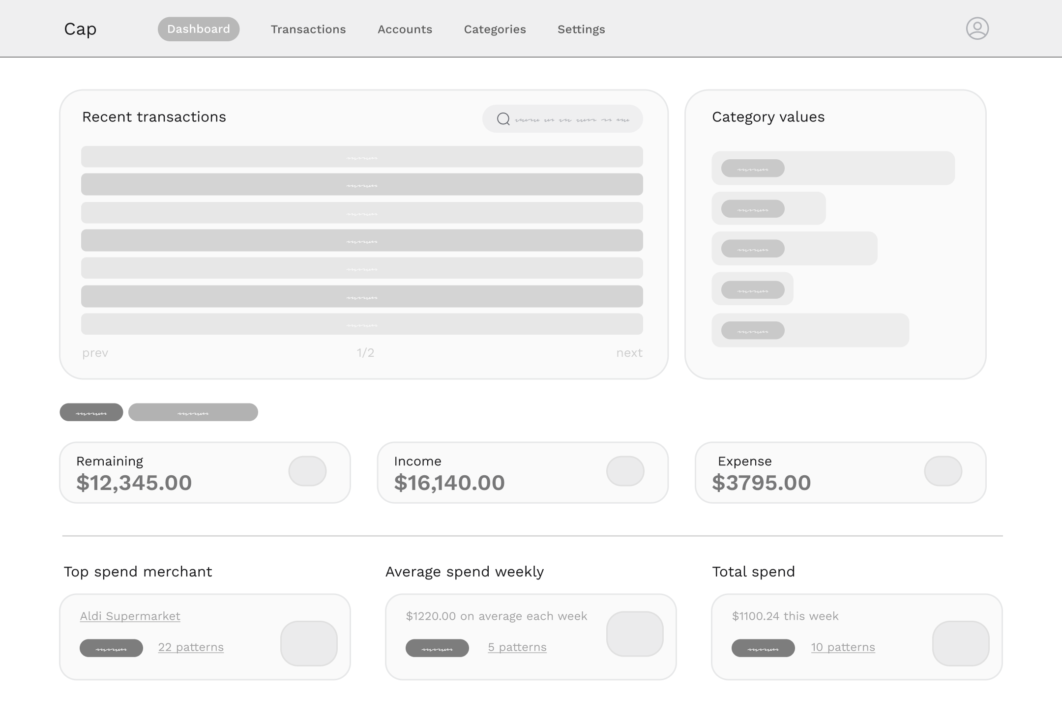
Early wireframes to understand the core features

Mobile breakpoint wireframes
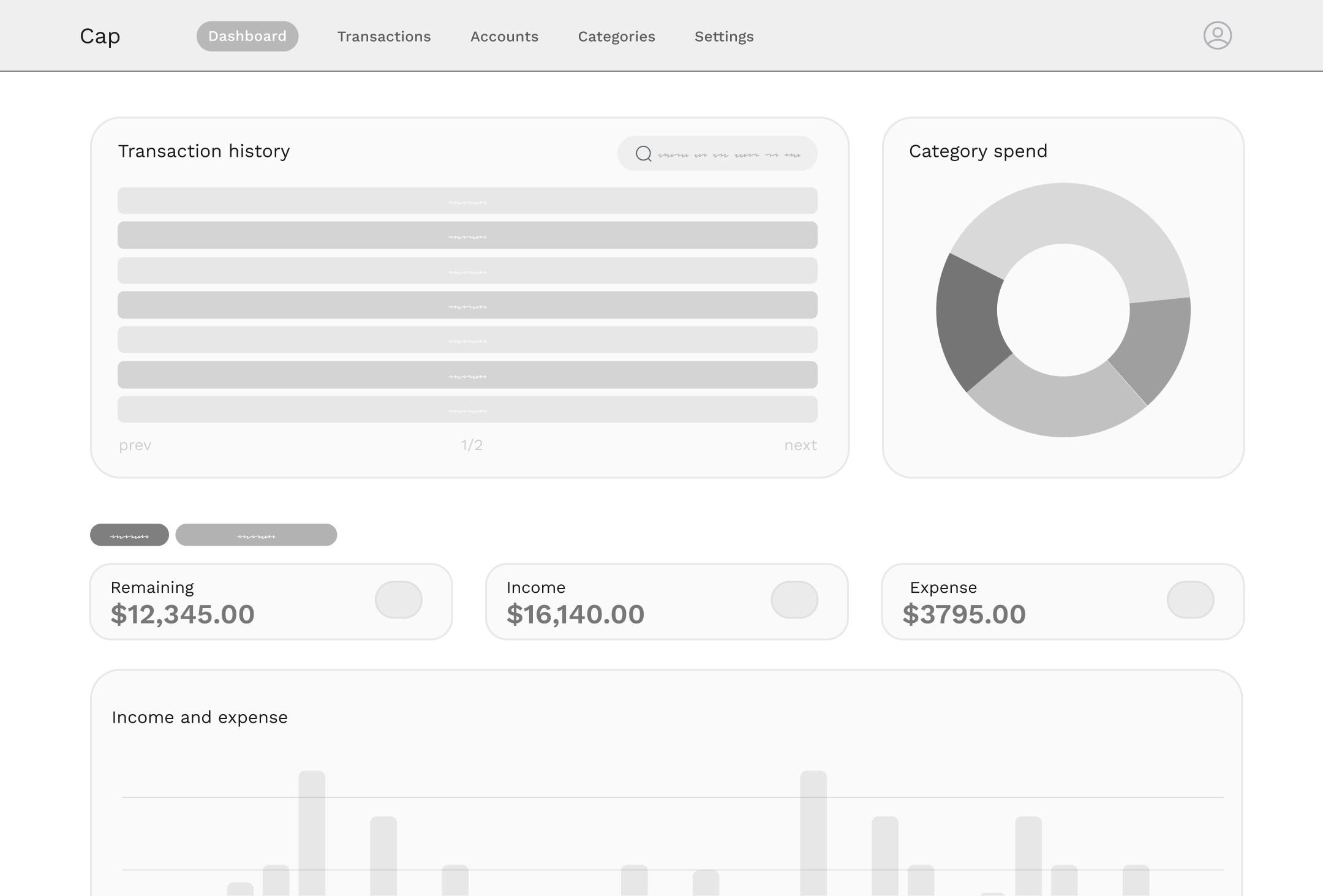
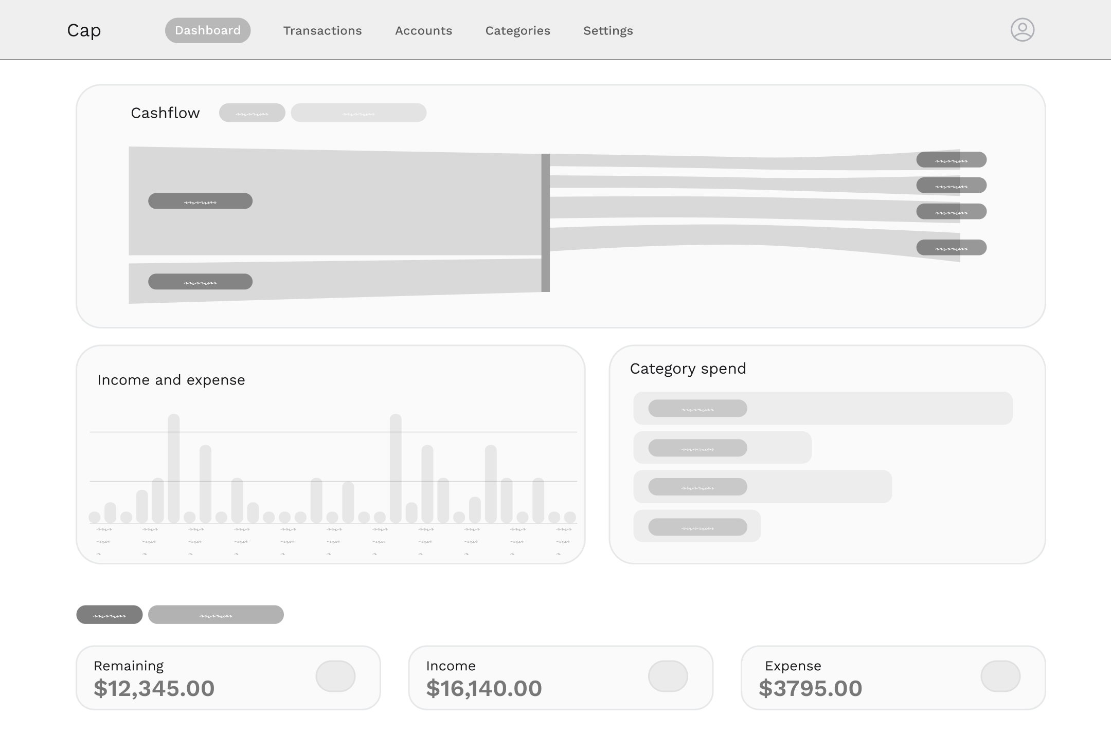
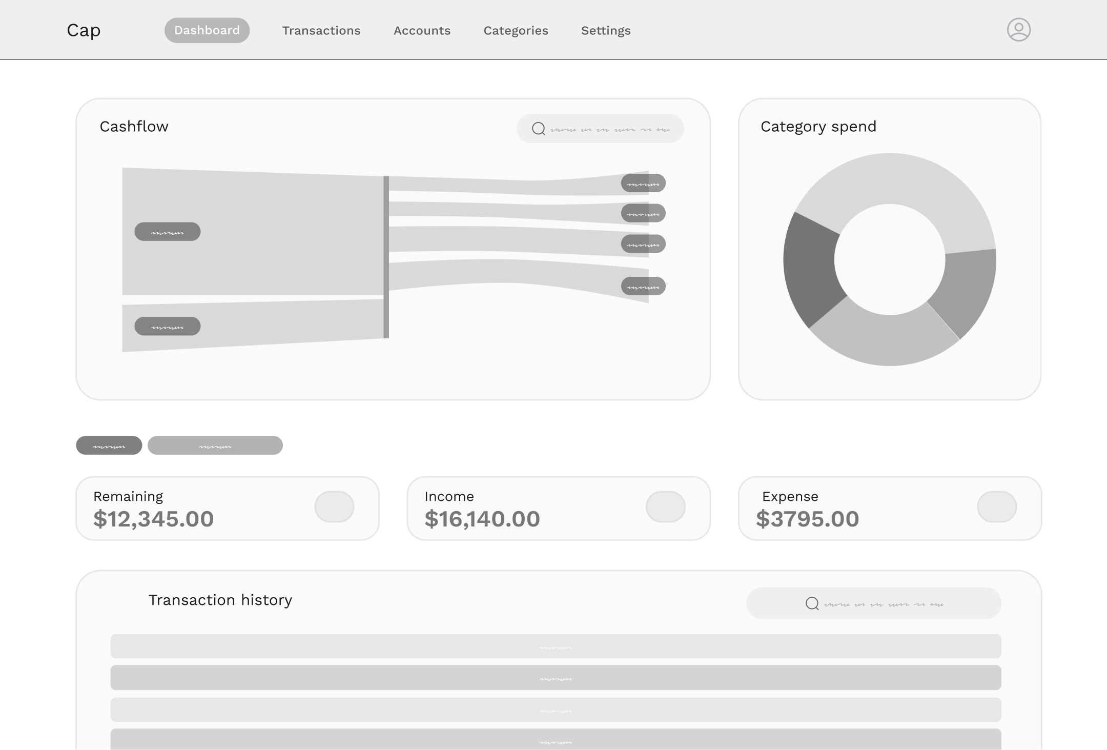
Early wireframes incorporating Sankey diagrams
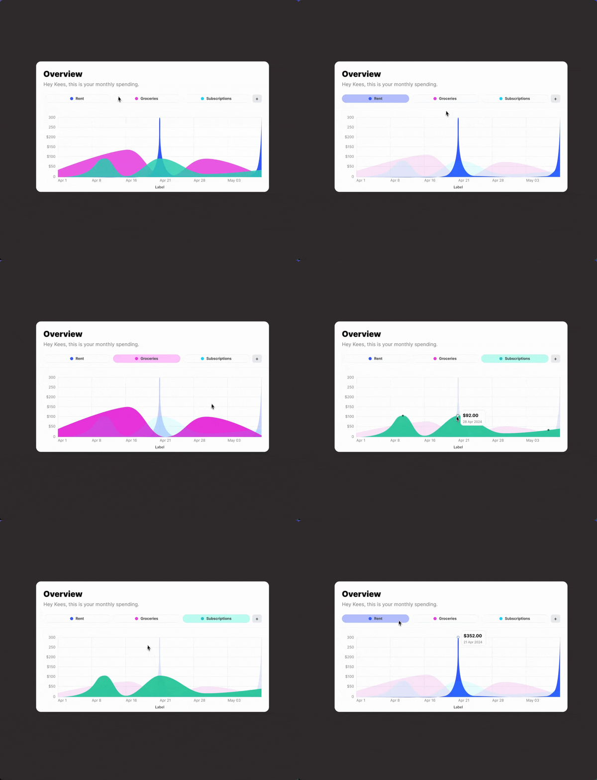
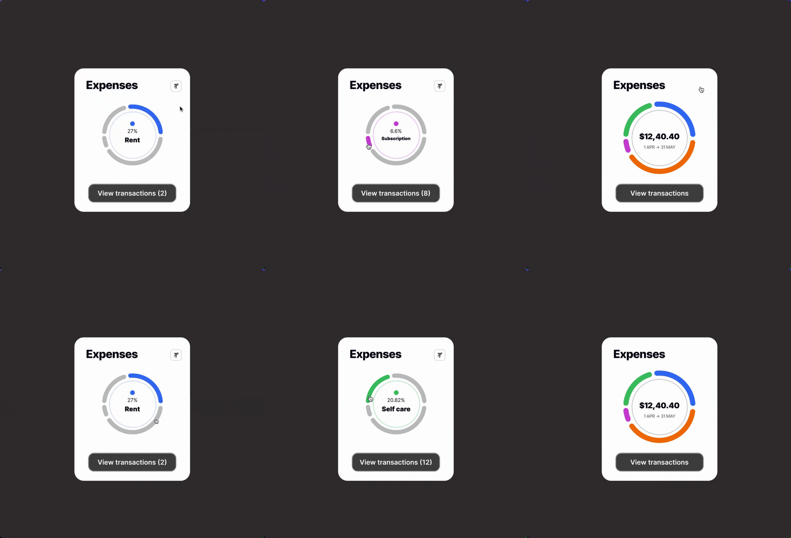
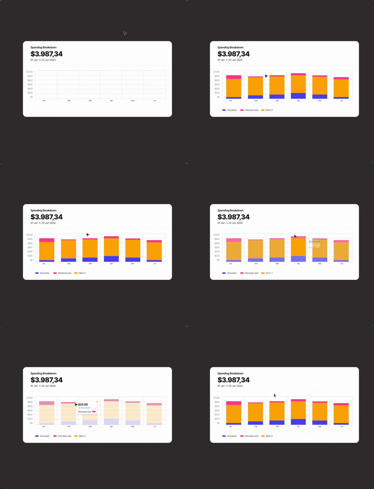
Exploring interaction prototype concepts
👨🏻💻 Proof of Concept (POC) Development
- • Built a working POC using Next.js, Tailwind CSS, Hono.js, and Neon DB to validate CRUD functionality for transactions.
- • Iterated on the POC to test key workflows and ensure the foundation aligned with user needs and future scalability.
This process allowed me to move quickly from conceptual designs to a functional product while ensuring technical feasibility and a strong user experience.
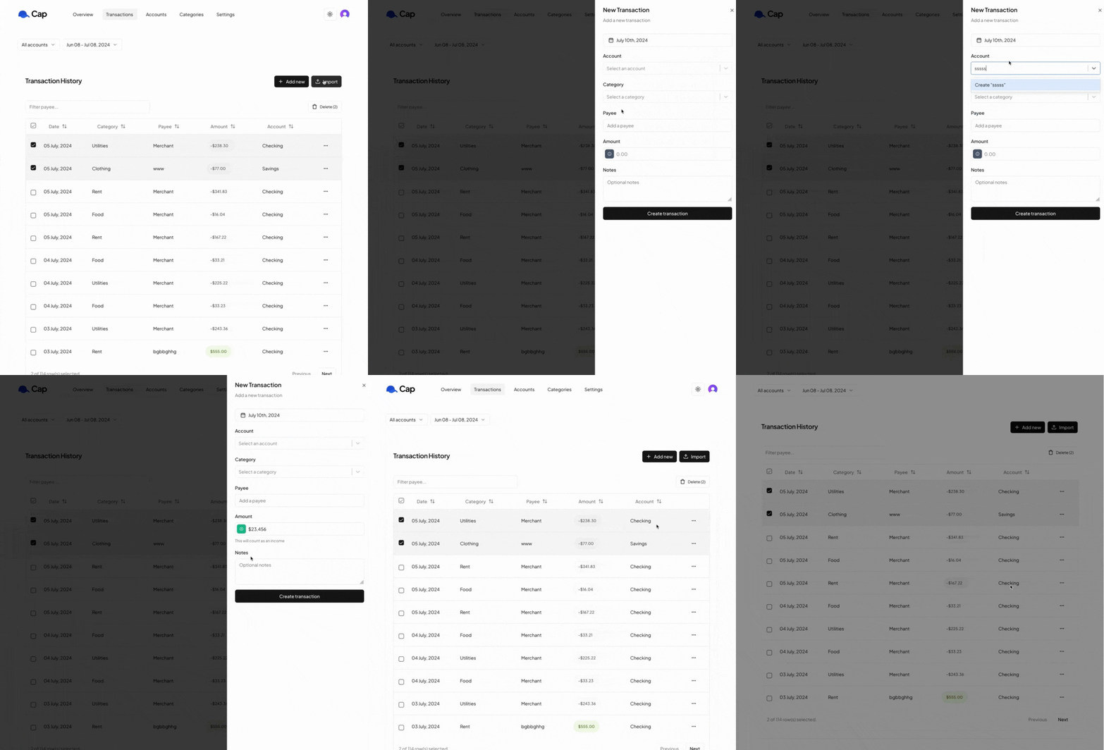
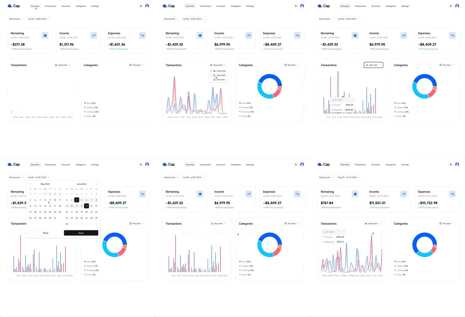
This POC (Version 3) focussed on core CRUD functionality and to test the way for importing CSV data
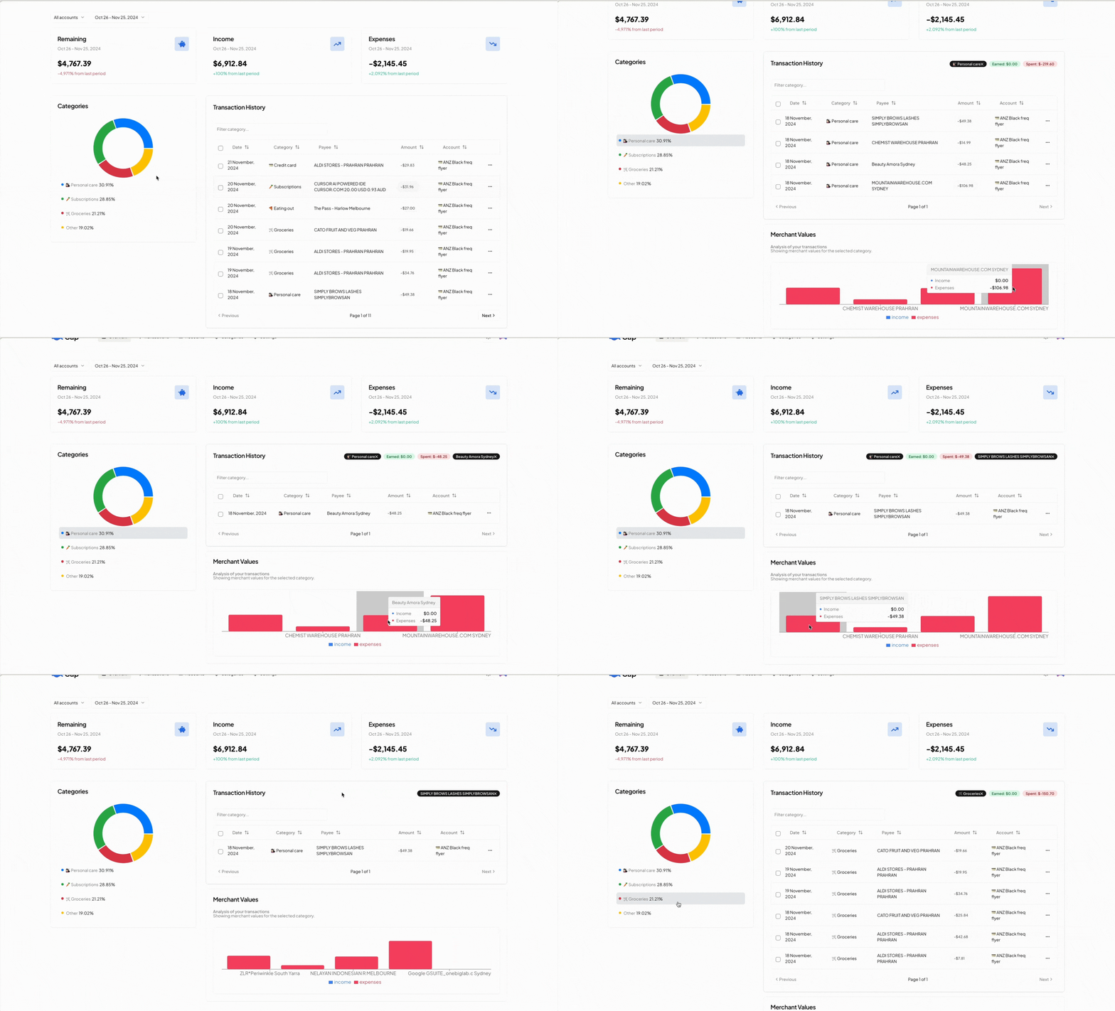
Iteration of POC V3 introduced more advanced filtering, enabling users to select categories to filter transactions and view aggregated values for each merchant.
Transitioning from POC to MVP
As we progressed from the POC to MVP, user feedback became central to shaping both the design and development. We gathered insights through interviews and usability testing sessions, ensuring every iteration addressed real user problems and informed future updates.
Key Feedback
- • Expense Tracking: Users wanted to compare total expenses across time periods, like last week or month, to identify patterns.
- • Spending Breakdown: A Sankey diagram emerged as the preferred way to visualise income flow across categories.
- • Savings Rate Monitoring: Users valued a clear view of their savings rate and how it compared to previous months.
How Feedback Informed Development

💡 Sankey Diagram
A visualisation that clearly maps how income flows into spending categories, helping users understand where their money goes at a glance.
📈 Trend Analysis
Dynamic insights showing total expenses and savings rates over time, enabling users to track progress and make informed decisions.
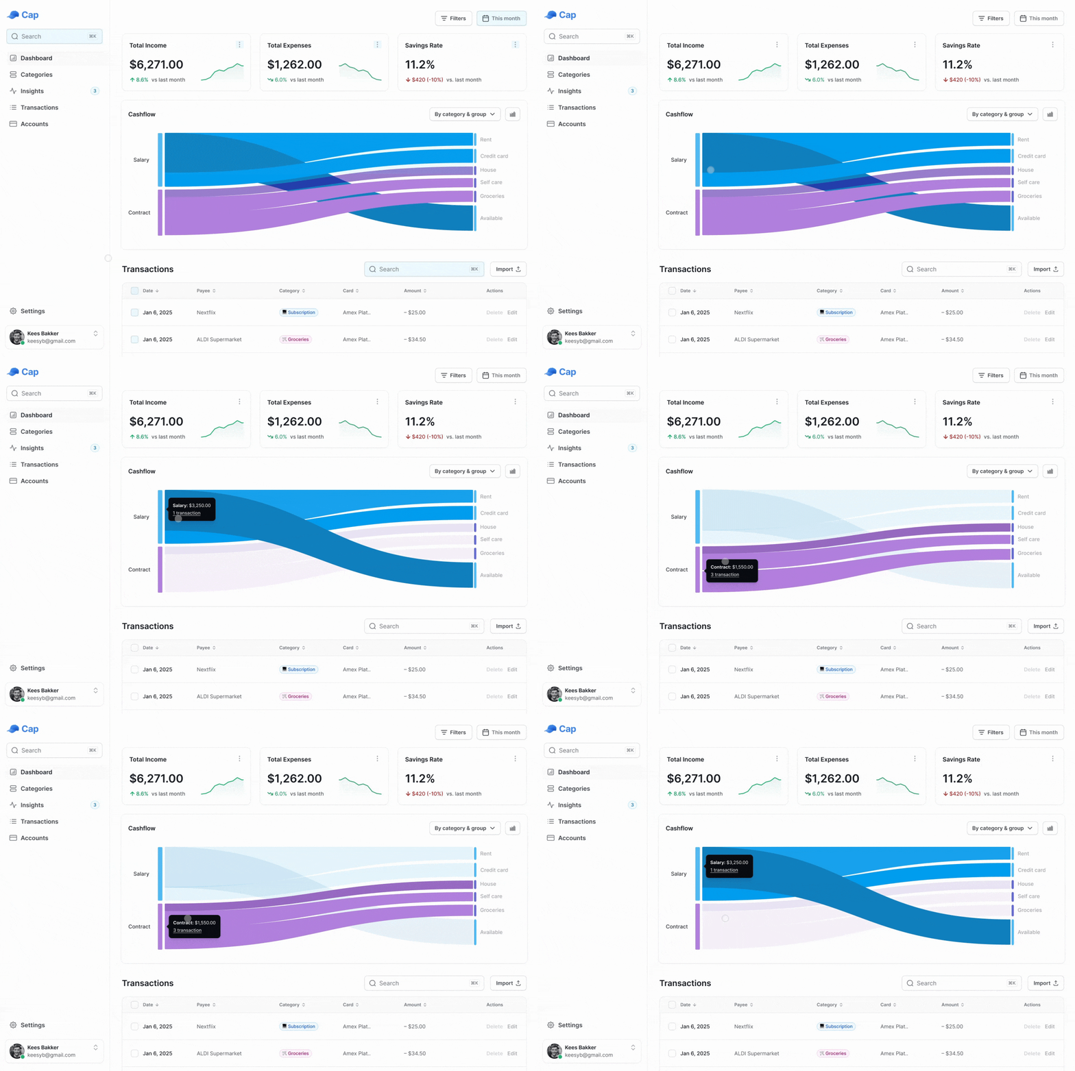
Sankey diagram and trend indicators on the dashboard
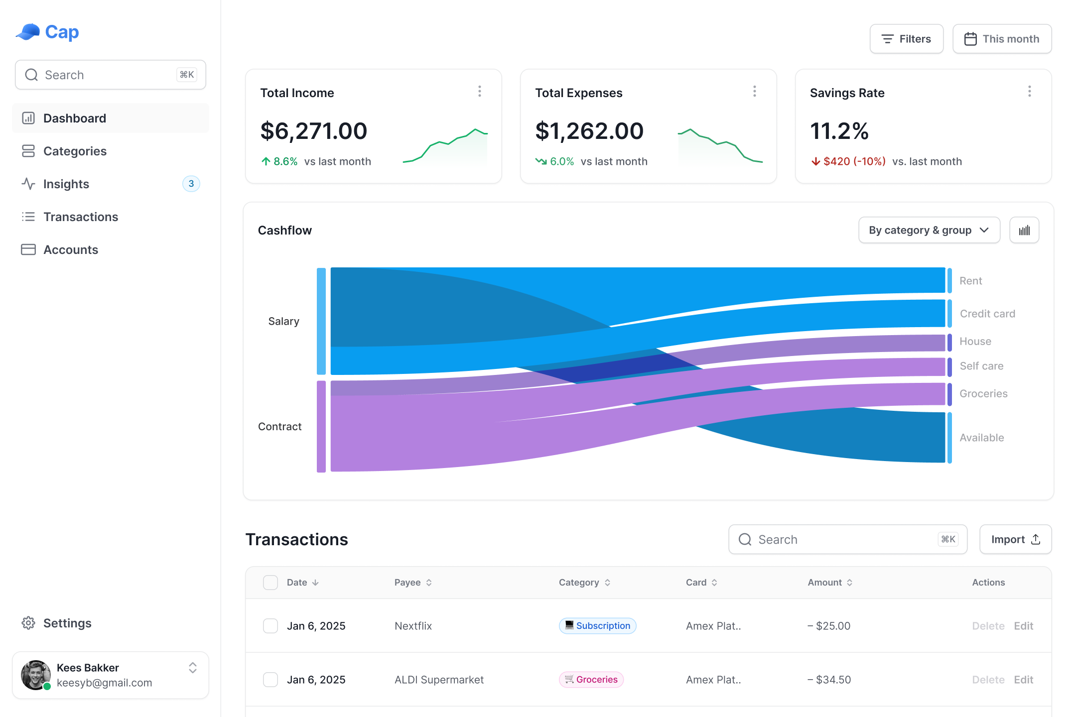
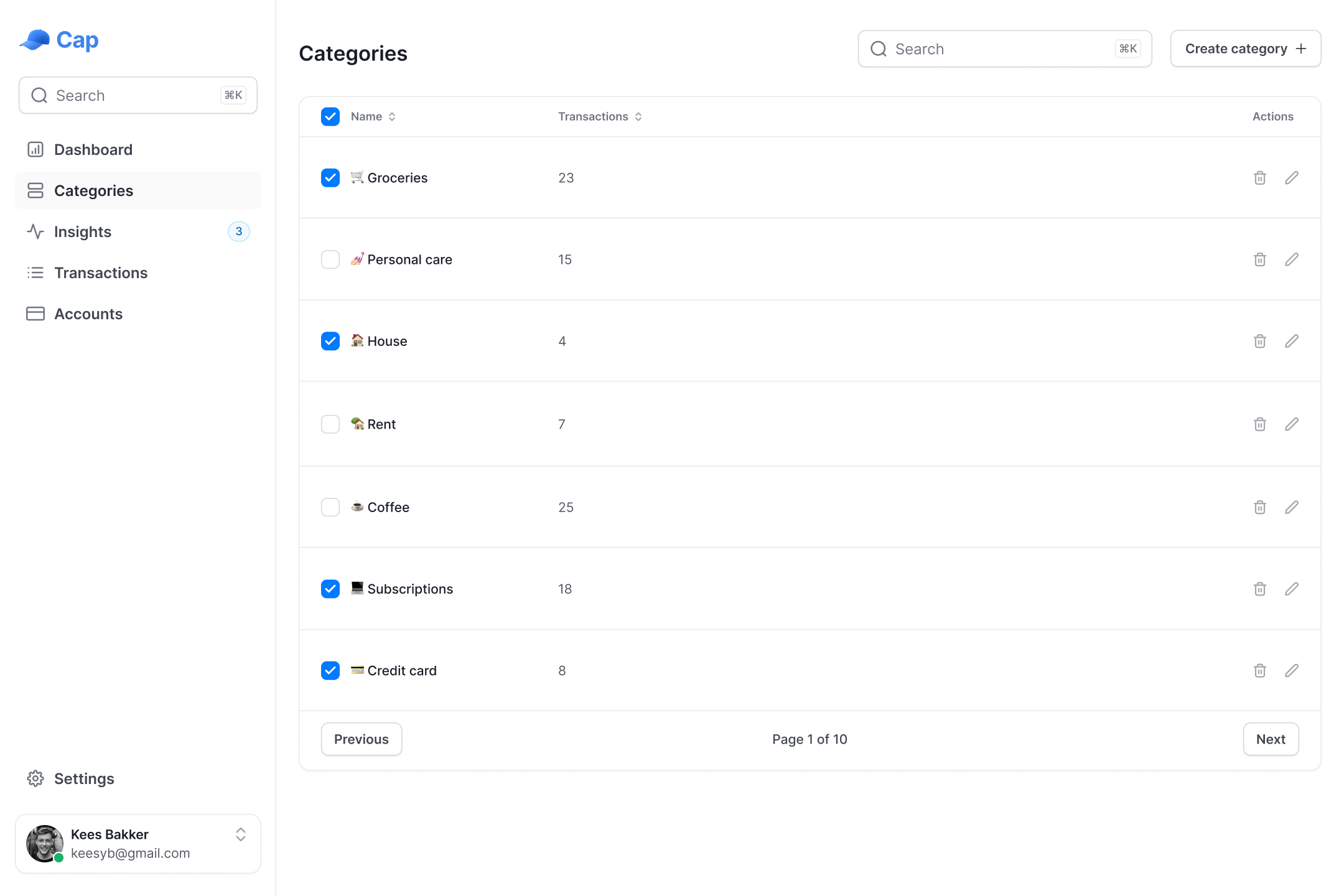
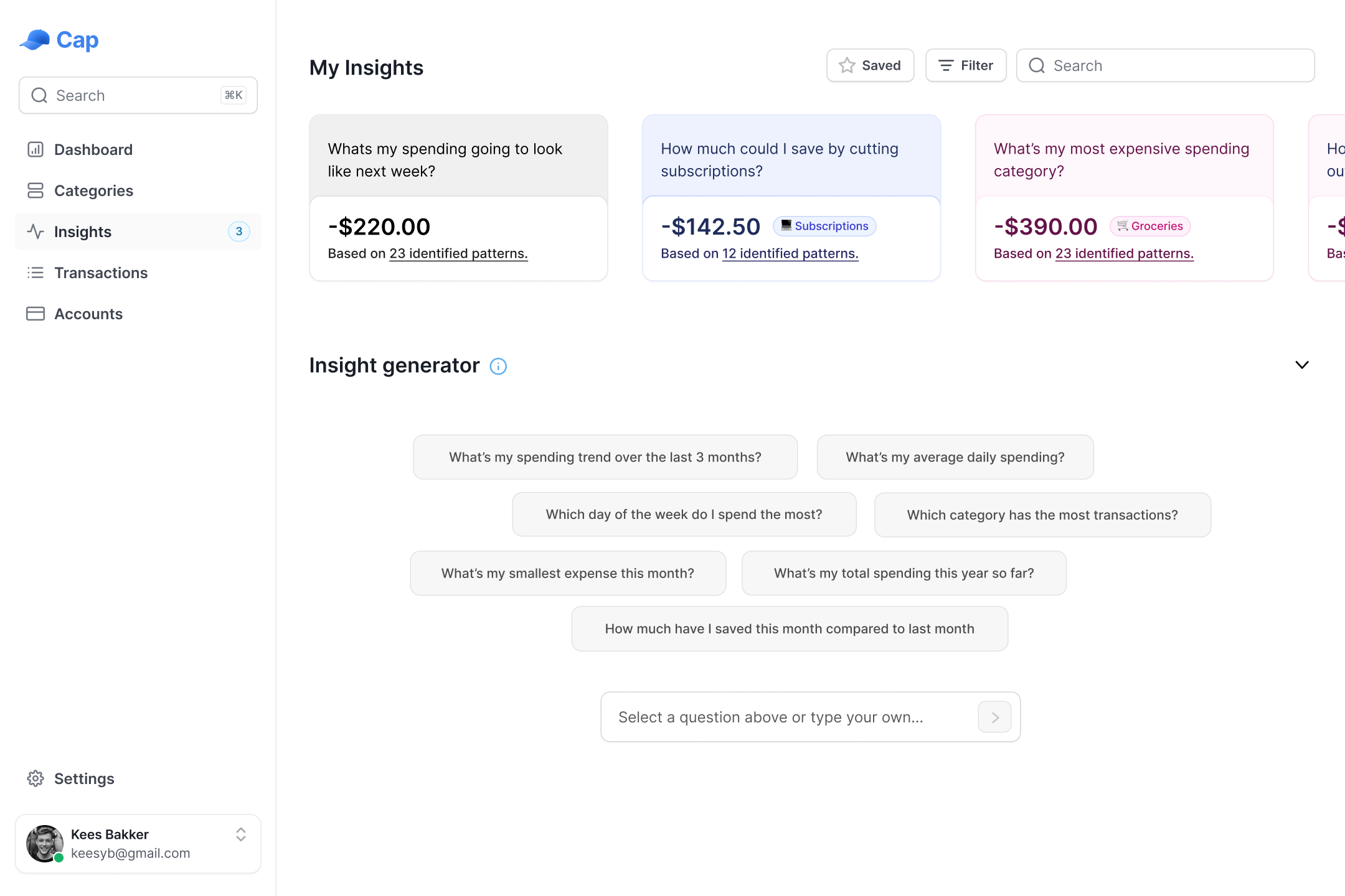
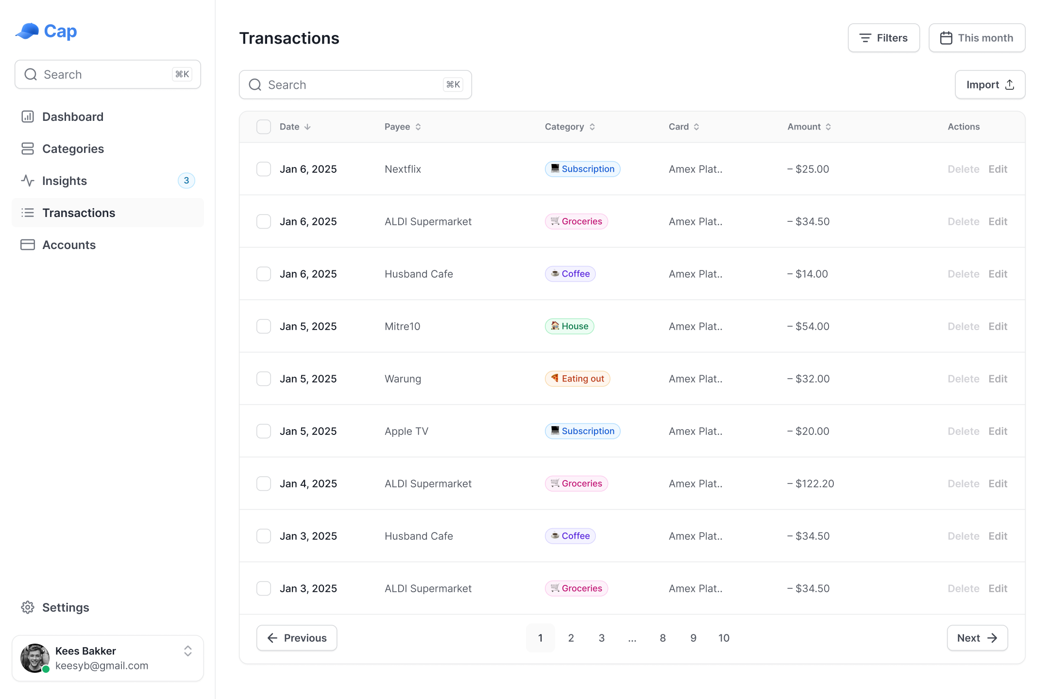
MVP designs for the dashboard, categories, insights and transactions
🎯 Next steps & Vision
- • Implementing MVP Designs: Translating the Cashflow Overview and other core features into code, ensuring they function seamlessly and align with design goals.
- • Building the Insights Feature: Conducting research and developing a separate POC to validate workflows for generative data visualisation, ensuring seamless integration into the MVP product.
- • Iterative User Testing: Continuing to gather feedback through testing to refine designs and validate that features address real-world financial challenges effectively.
As we refine Cap’s MVP, the focus remains on bridging design and development while staying true to user needs. Our priorities moving forward include: